Table of Contents
Your checkout page is the most critical moment in your customer’s journey. A shopper can browse your store, fall in love with a product, add it to their cart — and still leave without buying. In fact, the average eCommerce cart abandonment rate sits at around 70%, and a poorly designed checkout is one of the top culprits.
That’s why learning how to customize the Shopify checkout page isn’t just a design task — it’s a direct revenue strategy. Whether you want to strengthen your brand, reduce friction, or increase average order value, this guide walks you through every method, tip, and best practice you need.
Table of Contents
Why You Should Customize the Shopify Checkout Page
The default Shopify checkout page is functional, but it’s generic. It carries no trace of your brand, no trust signals unique to your business, and no opportunity to differentiate yourself from thousands of other stores using the same template.
When you customize Shopify checkout page, you accomplish three things at once: you reinforce brand identity, reduce customer hesitation, and create space for strategic revenue opportunities like upsells and cross-sells. These aren’t cosmetic improvements — they directly influence whether a customer completes a purchase or walks away.
What a High-Converting Checkout Page Should Include
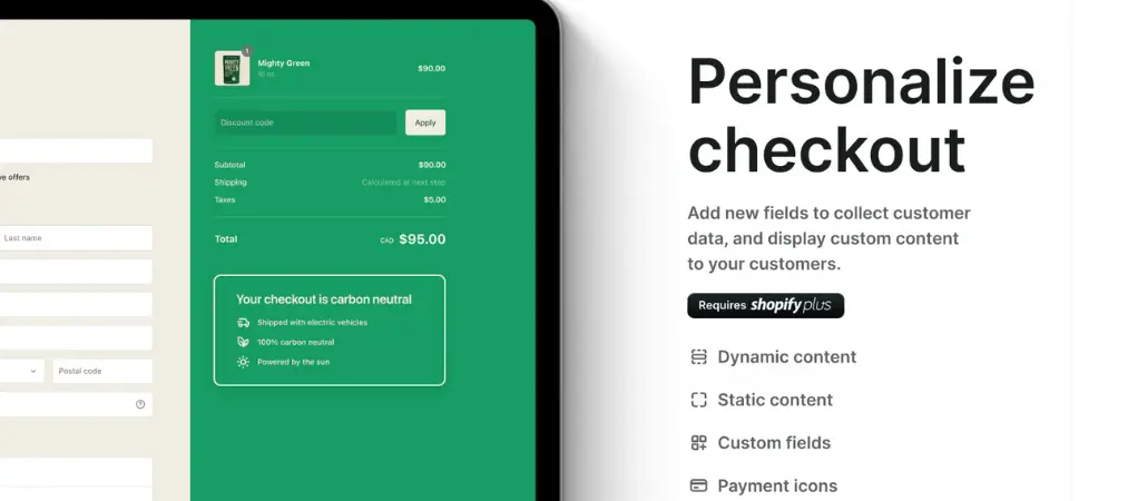
Before diving into the how, it helps to understand the what. A well-optimized checkout page typically contains:
A clear order summary so shoppers know exactly what they’re buying. Simple, focused form fields that collect only what’s necessary to process the order. Multiple payment options to accommodate different customer preferences. Visible trust indicators such as security badges, SSL notices, or return policy links. Transparent shipping costs and delivery estimates shown early — not buried at the final step. A prominent, easy-to-understand call-to-action button.
Every element on your checkout page should serve one purpose: moving the customer toward completing their purchase with confidence.
One-Page vs. Multi-Page Checkout: Which One Fits Your Store?
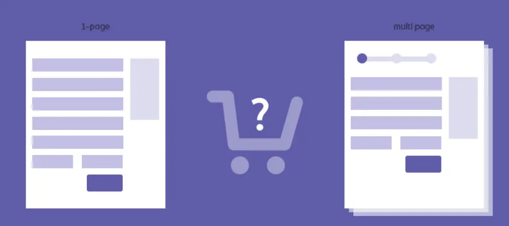
Shopify now defaults to a one-page checkout, where all fields — contact information, shipping, and payment — appear on a single screen. This format is faster and reduces the number of clicks required to complete a purchase, making it ideal for impulse-buy products and mobile shoppers.
Multi-page checkout, on the other hand, guides customers through separate steps. While it takes slightly longer, it can feel less overwhelming for complex purchases and makes it easier to identify exactly where shoppers are dropping off.
You can switch between these layouts in your Shopify admin settings under Checkout. Both formats are available on all plans from Basic and above.
How to Edit the Shopify Checkout Page: 3 Methods
Method 1: Use Theme Settings (All Plans)
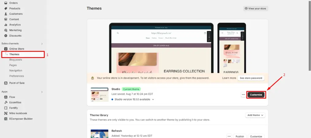
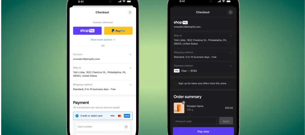
The simplest way to customize the Shopify checkout page is through your theme editor. Go to Online Store → Themes → Customize, then select Checkout from the page dropdown.
From here, you can upload your brand logo, change background colors for both the main content area and order summary panel, adjust typography for headings and body text, and set button and link colors. These changes take only minutes and make an immediate difference in how professional and trustworthy your checkout feels to customers.
Keep the design clean: use high-contrast color schemes for readability, avoid busy background images, and always match your checkout to your store’s overall branding.
Method 2: Install Checkout Apps (All Plans)
The Shopify App Store has a dedicated collection of checkout customization apps that extend what’s possible without any coding. You can add upsell sections to the order summary, display trust badges, collect gift messages or delivery date preferences, show promotional banners, and even offer post-purchase loyalty incentives.
These apps plug directly into Shopify’s checkout extension framework and automatically inherit your existing brand styles. This means a consistent look without the need for a developer.
Method 3: Checkout Branding API and Extensibility (Shopify Plus)
For merchants on Shopify Plus, the Checkout Branding API unlocks deep visual customization — custom favicons, precise border radius on buttons and form fields, and granular control over every design element. This requires developer support but delivers a fully unique checkout experience that no off-the-shelf theme can replicate.
Additionally, Shopify Plus merchants can use Shopify Functions to build custom discount logic, unique shipping rules, and advanced checkout validation without writing traditional server-side code.

Smart Ways to Improve Your Checkout and Lift Conversions
Simply editing the checkout page for branding is a good start. But the stores that see the biggest gains use their checkout page strategically. Here are proven tactics worth implementing:
Add a progress bar. For multi-step checkouts, a visible progress indicator reassures customers that they’re almost done and reduces the likelihood of abandonment.
Use upsells and cross-sells thoughtfully. Suggesting a complementary product — socks alongside shoes, for example — in the order summary area can meaningfully increase average order value. Keep suggestions relevant and non-intrusive.
Display trust badges prominently. Security seals, payment method icons, and clear return policy links address the silent doubts many customers have when entering payment details.
Enable guest checkout. Research consistently shows that forcing account creation is one of the leading reasons for cart abandonment. Always offer a guest checkout option alongside account sign-in.
Promote SMS or email sign-ups. Offering a small incentive — such as a discount on a future order — in exchange for a marketing subscription is a low-friction way to build your list right at the point of purchase.
Add a live chat or chatbot widget. For higher-ticket items, customers often have last-minute questions. A quick-response chat option can be the difference between a completed order and an abandoned one.
Optimize for mobile. More than half of eCommerce traffic now comes from mobile devices. Large tap targets, minimal form fields, fast load times, and a layout that works on small screens aren’t optional — they’re essential.
Common Mistakes When You Edit the Checkout Page on Shopify
Many merchants make avoidable errors when customizing their checkout. Overloading the page with upsell offers, promotional banners, and unnecessary form fields creates cognitive overload and pushes customers away. Ask only for information you genuinely need to fulfill the order.
Revealing shipping costs and taxes only at the final step is another major conversion killer. Extra fees that appear unexpectedly are the single most cited reason for cart abandonment. Show all costs transparently from the moment a customer enters the checkout.
Finally, neglecting mobile optimization is a costly mistake. A checkout that looks polished on desktop but is difficult to navigate on a phone will cost you a significant share of potential sales.
Checkout Customization and Your Post-Purchase Experience
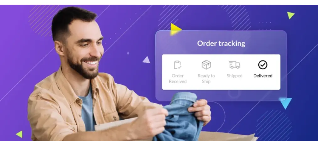
Customizing your Shopify checkout page doesn’t end at the “Place Order” button. The Thank You page and Order Status page are prime real estate for post-purchase upsells, loyalty program enrollment, and review requests. Post-purchase apps available in the Shopify App Store let you extend your brand experience and generate additional revenue from customers who have already committed to buying.
If you also want to ensure your post-purchase documents match the quality of your checkout experience, check out Customize Invoice on Shopify: Tools, Tips & Samples — a detailed guide on creating branded invoices that reinforce trust after every sale.
Checkout Extensibility vs. checkout.liquid: Which Should You Use?
Shopify is actively moving away from the legacy checkout.liquid file toward its Checkout Extensibility framework. Here’s a quick comparison:
Checkout Extensibility is available to all Shopify plans, requires no coding, uses app-based and API-based customization, and works with Shopify’s ongoing updates automatically. checkout.liquid is available to Shopify Plus only, requires coding knowledge, offers higher flexibility, but is being deprecated and will no longer receive new feature support.
Unless you are a Shopify Plus merchant with specific legacy needs, Checkout Extensibility is the right path forward for both new and existing stores.
Real Examples of Well-Customized Shopify Checkout Pages
Some of the most instructive examples of effective checkout customization come from established Shopify brands. Taylor Stitch uses a visible progress bar and a “Why Choose Us?” section directly on the checkout page to address customer hesitations in real time. Tentree leverages the upsell section not to sell more products, but to invite customers to plant additional trees — turning the checkout into a brand mission moment. Endy, which sells high-priced mattresses, integrates a chatbot so customers can get financing questions answered before they abandon. Chubbies offers multiple sign-in options plus a prominent guest checkout, removing the friction of forced account creation. Kinship streamlines everything into a one-click checkout flow, minimizing steps for customers buying lower-consideration products.
Each of these approaches reflects a deliberate decision about what matters most to that brand’s customers at the moment of purchase.
Best Practices Summary: Edit Shopify Checkout Page the Right Way
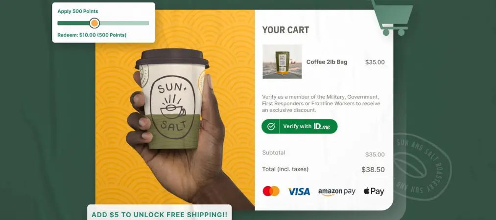
Keep the design minimal and focused. Every element should support the purchase, not compete with it. Make trust visible — security badges, clear policies, and recognizable payment icons. Show all costs early. Never surprise customers with fees at the final step. Test before you commit. Use A/B testing to measure the impact of changes on conversion rate and average order value. Think mobile-first. Design and test your checkout on mobile before desktop. Align your checkout with your brand. Colors, fonts, and messaging should feel like a seamless extension of your store.
For merchants looking to build a complete Shopify store foundation alongside a great checkout experience, the Shopify Website Builder for eCommerce: Full Guide on the Vify blog covers everything from store setup to optimization in one place.
Final Thoughts
Learning how to customize the Shopify checkout page — and doing it well — is one of the highest-return investments a Shopify merchant can make. The checkout is where purchase intent is at its peak. A seamless, branded, trust-building experience at that moment closes sales that a cluttered or generic checkout would lose.
Start with the basics: upload your logo, match your colors, and enable guest checkout. Then layer in trust badges, relevant upsells, and mobile optimization. If you’re on Shopify Plus, explore the Branding API and Shopify Functions for full control. Test continuously, and let your data guide the decisions.
And once the sale is sealed, don’t let the experience end there — use Vify Order Printer to automatically send professional, branded invoices that leave a lasting impression after every order.